Email is still one of the most dependable direct marketing channels available.
Facebook, Instagram, YouTube, Tik Tok, Twitter, etc are useful tools designed to target a given audience quickly and efficiently, they provide brand recognition and two-way communication which makes them very powerful. Email is considered a little old-school and not quite as immediate but is still very popular and hugely important to marketers.
Maximise your send by reaching that in-box
Given that you have an email database at hand, and you know exactly who you are trying to connect with, email stacks up pretty well against social media.
The key to getting your message through is to correctly format your emails, avoiding being red-flagged by spam engines on both Mail Servers and individual computers and devices.
Get the basics right
- Set up a SPF record - Without this set-up against your DNS, you'll struggle to get recognised as being legitimate
- Get permission - Always seek permission from the recipient
- Must have a return email address - It should be clear and concise
- Subject line must not be deceptive - Don’t include too many exclamation marks, dollar signs, ALL CAPS, multiple emojis, or sales lines and offers
- Opt-out options must be available - Offer a way to get off the mailing list (you must comply with the CAN-SPAM Act)
- Squeaky clean Send list - Make sure that you are sending to legitimate email accounts, remove old and unused emails regularly
- Eliminate poor grammar - To spam engines this could be a sign that a machine may have created the email.
- Link to good content - Don’t provide links to shady websites
- Images - Use them correctly, we’d suggest that you use one image per story. Spam engines are suspicious of emails that contain a single image and very little text. Why? Because spammers can use whatever text they want in an image and it can’t be read by spam filters, this sets off a red flag.
- Don’t use attachments - We strongly advise not to do this. If you want someone to download something, include a link to a webpage on your site (from there they can download the file).
- Get on the Whitelist - Ask your recipients to ‘Whitelist’ your emails
- Add a physical address - Good practise to include at the bottom of your email - When doing bulk email sends, this can help
- Ensure that your newsletter design is compliant - Aim to reach the majority of your audience
How do we get it to look right?
Stream has a long history of newsletter design dating back to our Fantasy Rugby days when we used MAIL to send 53,000 emails every week during the rugby season. We learned a lot about the pitfalls of the different email clients and the spam engines which at times, would intercept our emails and place them onto blacklists, which are super-hard to get off.

MAIL was actually improved and honed during this time to reduce issues with in-built tools, like email validation, batch sending, text-only emails (for when users turn off images) and simple bulletproof templates that would work on all email systems. Back then we didn’t have to deal with mobile interfaces, web-based email clients and the multitude of versions that exist today, eg. Outlook 2007, 2010, 2013, 2016, 2019.
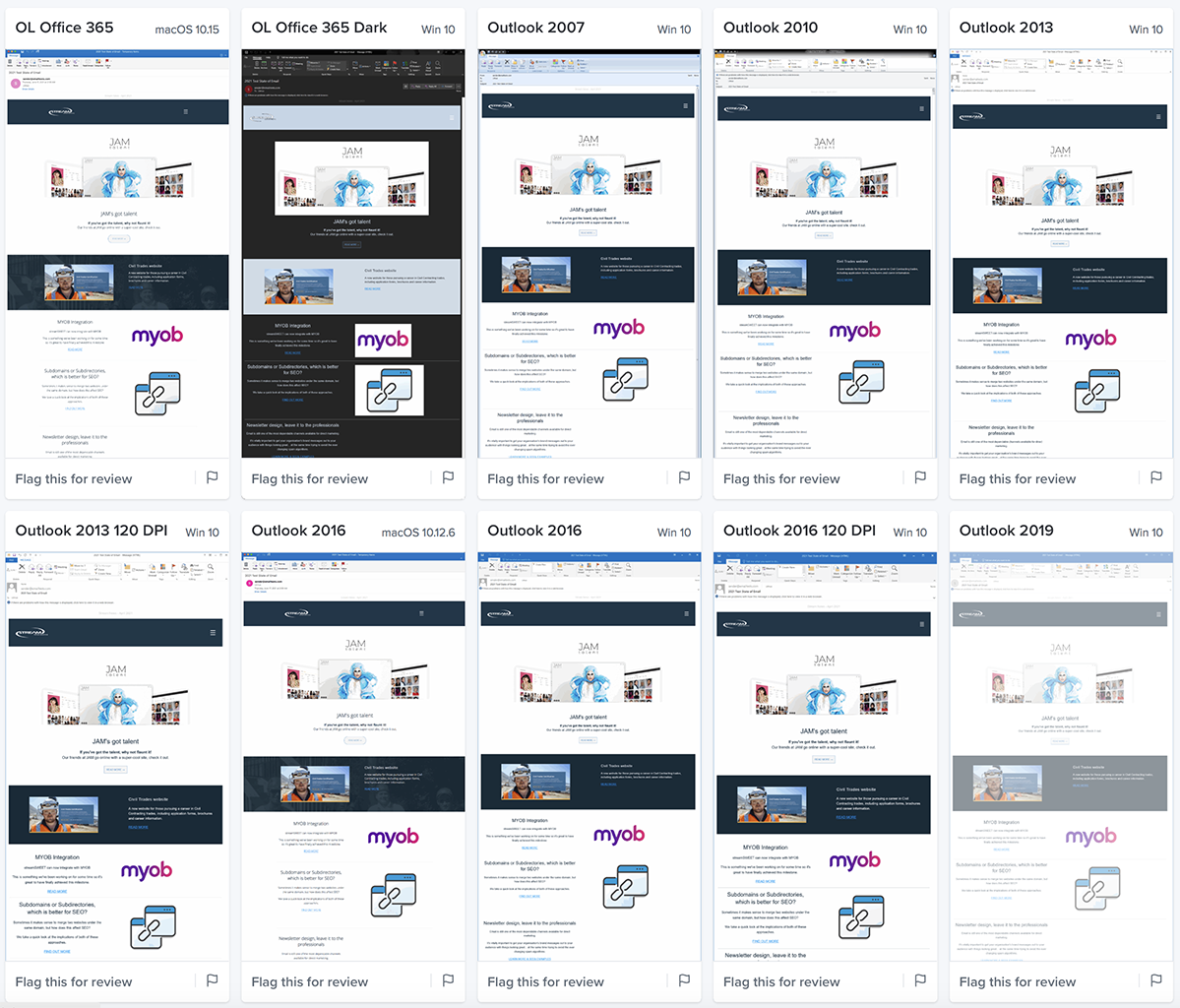
At Stream we test our designs through a leading edge emulator that picks up anomalies and errors, giving you the best chance to succeed with your sends. It can produce screenshots of a newsletter, at full-size, showing most of the popular email clients that are currently in use today (90+ apps and devices). This list is constantly changing and evolving so we're more than happy to use professional tools to keep up with 'email technology'.
Email technology... well that's not quite correct. Most of the issues we encounter come about because we have to consider so many old and outdated technical requirements, trying to be backwards compatible is a huge part of the nightmare. We'll never get them looking the same on every device but we aim to make them readable and as consistent as possible.
Previewing emails in the emulator
We use a professional email emulator to preview our newsletter designs. This gives us a good idea of some of the variants that we may encounter.

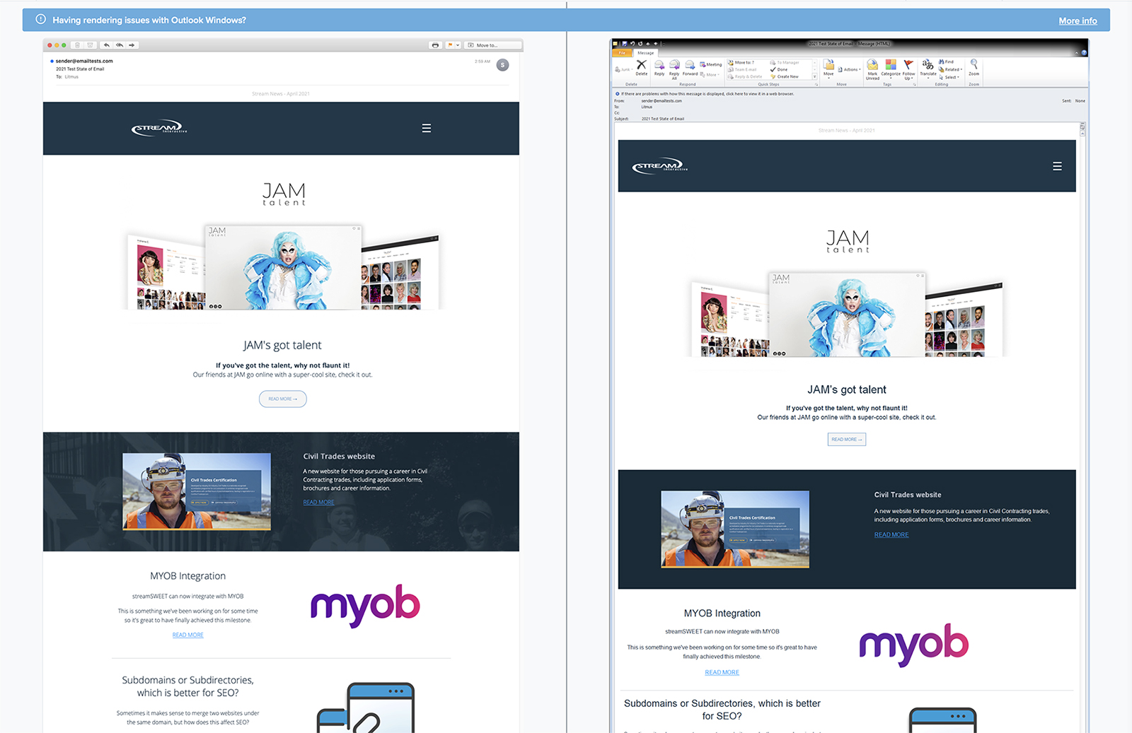
Example: Apple Mail 14 - macOS 11.0 (left) - Outlook 2010 - Windows 10 (right)
Note: the rounded button, the background photo, Google Fonts, story widths and padding have been ignored by Outlook. Also the logo and hamburger menu have different width spacing. Although there are numerous differences, the design still gets the core messages through and the reader is able to interact with the content.

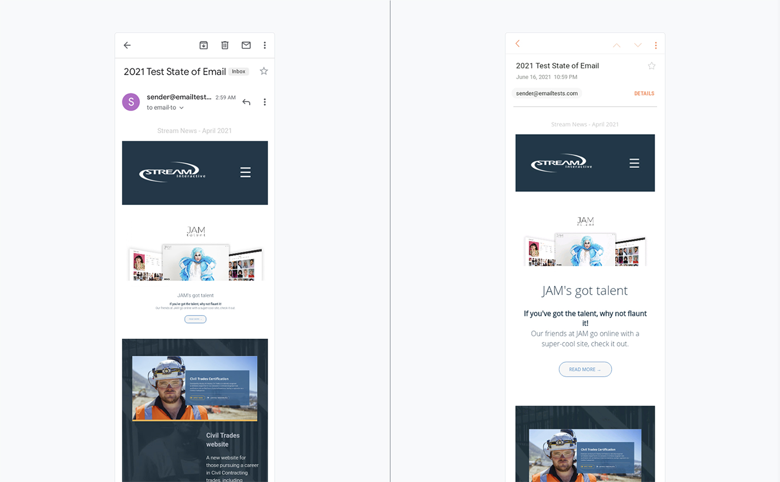
Example: GMAIL App (Android 8.0) - Samsung Mail (Android 7.0)
Mobile devices provide another challenge, in this comparison you can see several differences that must be considered.

If you need a robust, well designed newsletter that enhances your brand contact us to find out more.